

Data Visualization: Color Guidelines
Since its inception, Computershare has grown through various acquisitions and mergers, creating multiple business lines that require a cohesive brand identity. To establish a global brand standard, the design systems team focused on addressing the diverse needs of these products.
As part of our brand refresh, I was assigned to redefine our data visualization guidelines. My experience presenting data analytics for the newly designed dashboard and the reporting section for the issuers guided my approach to this initiative.
Key Considerations
Define overarching guidelines in accordance with WCAG 2.2 guidelines
Identify popular chart types
Develop a color palette and define applications complimentary to the primary brand color for both light and dark themes
Define text styles and shapes
Identify atoms, components, and charts
Client
Computershare
Team
Global Design System Lead, Head of UX, Product Owner, UX Designers
My Role
Global Design System team lead for Data Visualization
My Role and Responsibilites
Phase 1
Lead research and design efforts to develop a customized color palette that focuses on the intersection of data visualization and brand color application, while adhering to WCAG 2.2 (Web Content Accessibility Guidelines) for the Computershare global design system.
Main tasks and considerations
Research best practices for accessible visualization
Create a color palette applicable for both light and dark themes
Identify and shortlist types of charts
Result
Our collaborative efforts enabled us to develop a color palette that fulfilled our business requirements while adhering to the WCAG 2.2 accessibility guidelines.
Goals and Strategy
To achieve our end goal, it was crucial that we develop a range of targeted strategies to enable us to successfully navigate the course.
Research
In my initial research, I began by defining the key elements of a data visualization style guide, focusing on the financial sector. I read through multiple design systems and style guides, focusing on standard practices and how they vary across different types of organizations. Carbon Design System from IBM, Salesforce, Atlassian, and DBS, as well as resources like datawrapper.de, Vitaly Friedman IDF masterclass on accessible and inclusive design patterns, Medium articles, and AM charts, provided an in-depth study of the various considerations that need to be taken into account.
Designing for data presents a unique challenge. Selecting colors for a palette requires precision and a strong understanding of numbers, alongside careful consideration of the audience, their perceptions, and accessibility constraints. Since the information must be conveyed accurately and understood correctly, additional design constraints are related to the density of information that data visualizations often need to communicate. Over and above, one must balance the brand identity by creating color palettes for different data types and adhering to accessibility requirements for color blindness and contrast.
I collaborated with fellow designers on the design system team to ensure that the Data Visualization Style Guide aligns with the company’s global design system. My immediate goal was to identify and create a color palette that could be applied uniformly across multiple business lines while also complying with the WCAG 2.2 standards.
Tools used to support my research
Miro | Figma | chroma.js | viz palette | Adobe color accessibility tools | Leonardocolor.io | Stark
Color theory
Choosing a Triadic color theme ensured access to a vibrant color scheme, facilitating the selection of primary, secondary, and tertiary colors.
Triadic color theory involves choosing three colors that are evenly spaced around the color wheel, forming a triangle when connected. This method creates a visually balanced and vibrant contrast among the selected hues. Essentially, it means selecting three colors that are 120° apart on the color wheel (for example, red, blue, and yellow).
While the individual colors may not always be vibrant, the overall scheme can create a lively effect, as it maintains harmony while offering high contrast. Presenting visually appealing data is generally easier with a triadic scheme than with a complementary color scheme.
Color theme
When selecting colors to create a palette, it is essential to consider an organization's brand and values. Colors carry their own emotional significance. The following set of color themes conveys various emotions and values that an organization may wish to express.
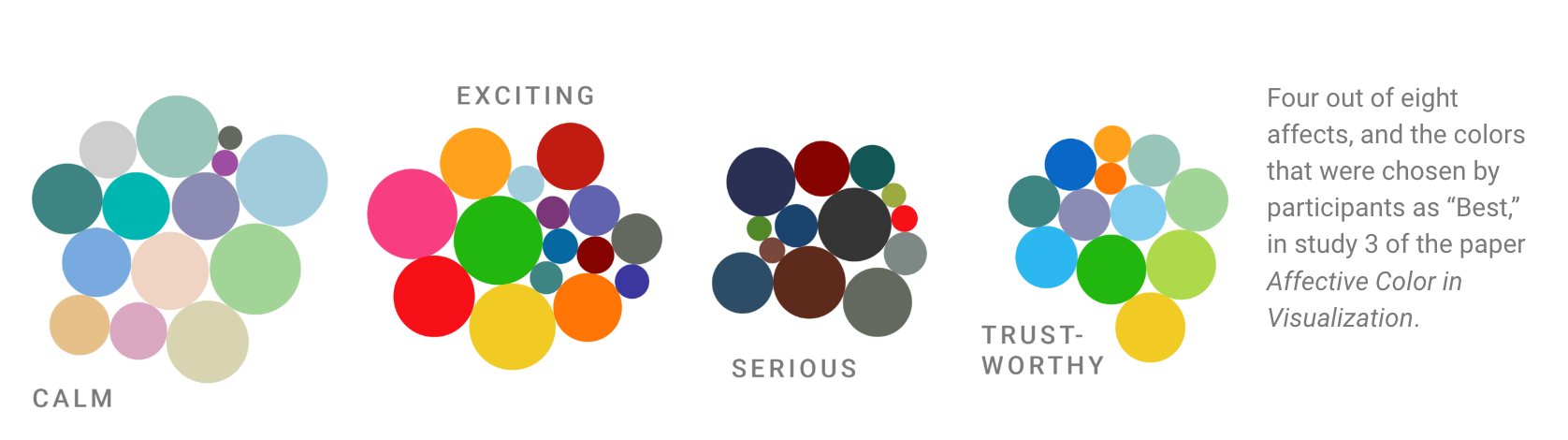
Color Themes (Source)
The color palette for Computershare had to project trustworthiness with a hint of excitement for a revised modern outlook. Accessibility also played a key role in the selection process. To avoid any misconceptions, we agreed to leave the brand purple as one of the primary or secondary colors. Working alongside with some of the other UX designers, I used tools like Coolers.co: the super fast color schemes generator to find other colors, tints, and shades that work well with the brand purple. There were rounds of presentations and iterations with the product and the brand team before arriving at the solution illustrated below.
To harmonize with the company logo color, I chose a shade of blue as the primary color for the data. Blue represents power and trust, key ingredients when people engage with an organization that handles their money. Next, I picked red and yellow as the secondary colors to contrast distinctly from blue. The primary blue color scheme with red and yellow as accent colors is also considered a safe colorblind palette to comply with the accessibility* guidelines.
Further tweaks were made to the shades of red and yellow, adjusting the hue and saturation level to be more muted. This resulted in a more cohesive blend with the dominant blue. A fourth color, purple, was added to the palette to represent a more diverse range of data.
*Accessibility: The color that looks mostly the same for people with normal vision and readers with
red-/green-blindness (the most common types of colorblindness) is blue.
“Blue is the safest hue.” For red- and green-blind readers to perceive color as depicted, choose blue. If one needs multiple colors, the safest choice is to mix blue with orange
or red. (Source)

Once I had identified the essential set of colors, I proceeded to expand the palette and define the application guidelines. I meticulously crafted and refined a ten-point scale by leveraging resources such as Leonardocolor.io, Coolors, chroma.js, and Adobe Color. In addition to the primary and three secondary colors, I strategically incorporated teal and brand purple, enhancing our categorical palette for a richer and more engaging visual experience.
The ten-point scale made selecting the color themes for both the light and the dark modes easy. The darker tones offered the right amount of contrast for the light theme and the light tones of the same color value fitted in nicely for the dark theme.
Background Color: Colorful backgrounds can seem like an exciting idea and are huge brand identifiers. However, charts with background colors can also be limiting, resulting in fewer choices for the color of the chart elements.
Considering that I had to keep both the light and the dark theme in mind, I decided to stick with a neutral background to support the range of colors applied to charts and graphs and offer the best contrast for accessibility.
Color Palette
Key guidelines for application
- Emphasize what you want readers to see with color
- Make everything gray except what’s important.
- Don’t use gray like other colors.
- Use the same hue for less important categories, but desaturate it
Categorical palettes
Categorical (or qualitative) palettes are best when you want to distinguish discrete categories of data that do not have an inherent correlation. Developing a categorical palette is probably one of the most challenging tasks. One has to develop a wide range of colors and ensure a contrast ratio of 4:5:1 between adjacent values.
The sequence was carefully curated to maximize contrast between neighboring colors to help with visual differentiation. Tools like Stark, Adobe Color Accessibility, and the Viz Palette were extremely useful in determining the colors of this palette. Before arriving at the final solution, multiple rounds of ideation, testing, and iterations were required. I also had to establish strict guidelines for usage so the designers did not stray and create their versions.
Sequential palettes
Sequential palettes or gradient effects are appropriate for relationship and trend charts. In light themes, the darkest color indicates the largest values; in dark themes, the lightest color signifies the most significant values. The ten-point scale could be applied when depicting a trend in data.
I collaborated with fellow designers on the design system team to ensure that the Data Visualization Style Guide aligns with the company’s global design system. My immediate goal was to identify and create a color palette that could be applied uniformly across multiple business lines while also complying with the WCAG 2.2 standards.
Tools used to support my research
Miro | Figma | chroma.js | viz palette | Adobe color accessibility tools
Color theory
Colors (color theory: Triadic: Take three equally distant colors on the color wheel (i.e., 120° apart: e.g., red/blue/yellow). These colors may not be vibrant, but the scheme can be as it maintains harmony and high contrast. It’s easier to make visually appealing designs with this scheme than with a complementary scheme.
Defining color palette
Choosing a Triadic Color Theme ensured access to a vibrant color scheme, facilitating the selection of primary, secondary, and tertiary colors.
Context: Blue seemed like an appropriate primary color for the data in the fintech app because blue represents power and trust—key ingredients whenever people engage with an organization that handles their money. In addition, the primary blue color scheme with red and yellow as accent colors is also considered a safe colorblind palette to comply with the accessibility* guidelines. Furthermore, each color was selected to reflect the brand identity and to evoke the desired emotion.
*Accessibility: The color that looks the most the same for people with normal vision and readers with
red-/green-blindness (the most common types of colorblindness) is blue.
“Blue is the safest hue.” For red- and green-blind readers to perceive color as depicted, choose blue. If one needs multiple colors, the safest choice is to mix blue with orange
or red. (Source)
Color Themes (Source)
Color harmony and color contrast
Further tweaks were made to the shades of red and yellow, adjusting the hue and saturation level to be more muted. This resulted in a more cohesive blend with the dominant blue and complimented the primary brand color. A fourth color, a shade of purple, was added to the palette to represent a more diverse range of data.
Once the key colors had been identified, it was time to expand the palette and establish the application guidelines. I leveraged sites like Coolors, chroma.js, and Adobe color accessibility tools to build the ten-point scale.
Background Color: Colorful backgrounds can seem like an exciting idea—and they are huge brand identifiers. However, charts with background colors can also be limiting, resulting in fewer choices for the color of the chart elements.
Considering that I had to keep both the light and the dark theme in mind, I decided to stick with a neutral background to support the range of colors applied to charts and graphs and offer the best contrast for accessibility.
Key guidelines for application
- Emphasize what you want readers to see with color
- Make everything gray except what’s important.
- Don’t use gray like other colors.
- Use the same hue for less important categories, but desaturate it
Redesigned a product that significantly enhanced the user experience with more intuitive navigation and added features, empowering users in their daily communications and interactions with clients.
Introduced a more user-friendly self-service option that encouraged clients to access their individual accounts for quicker responses, significantly reducing the workload of the call center and enhancing overall customer satisfaction.
Successfully transitioned the team from UXPin to Figma, building a comprehensive style library, components, and templates, demonstrating our team's adaptability and commitment to improving our design processes.
Key Achievements
Future Enhancements
Based on the most recent feedback, further iterations and enhancements to the design are underway. The upcoming launch will showcase a product that offers:
An interactive dashboard with real-time analytics and customizable widgets based on user needs.
Conformance to WCAG 2.2 guidelines.
Light and dark themes.
Intuitive navigation and new features.